Posts
An article from the Nature.
I used {ggh4x} package for the first time, to modify y-axis ticks.
Selected article:
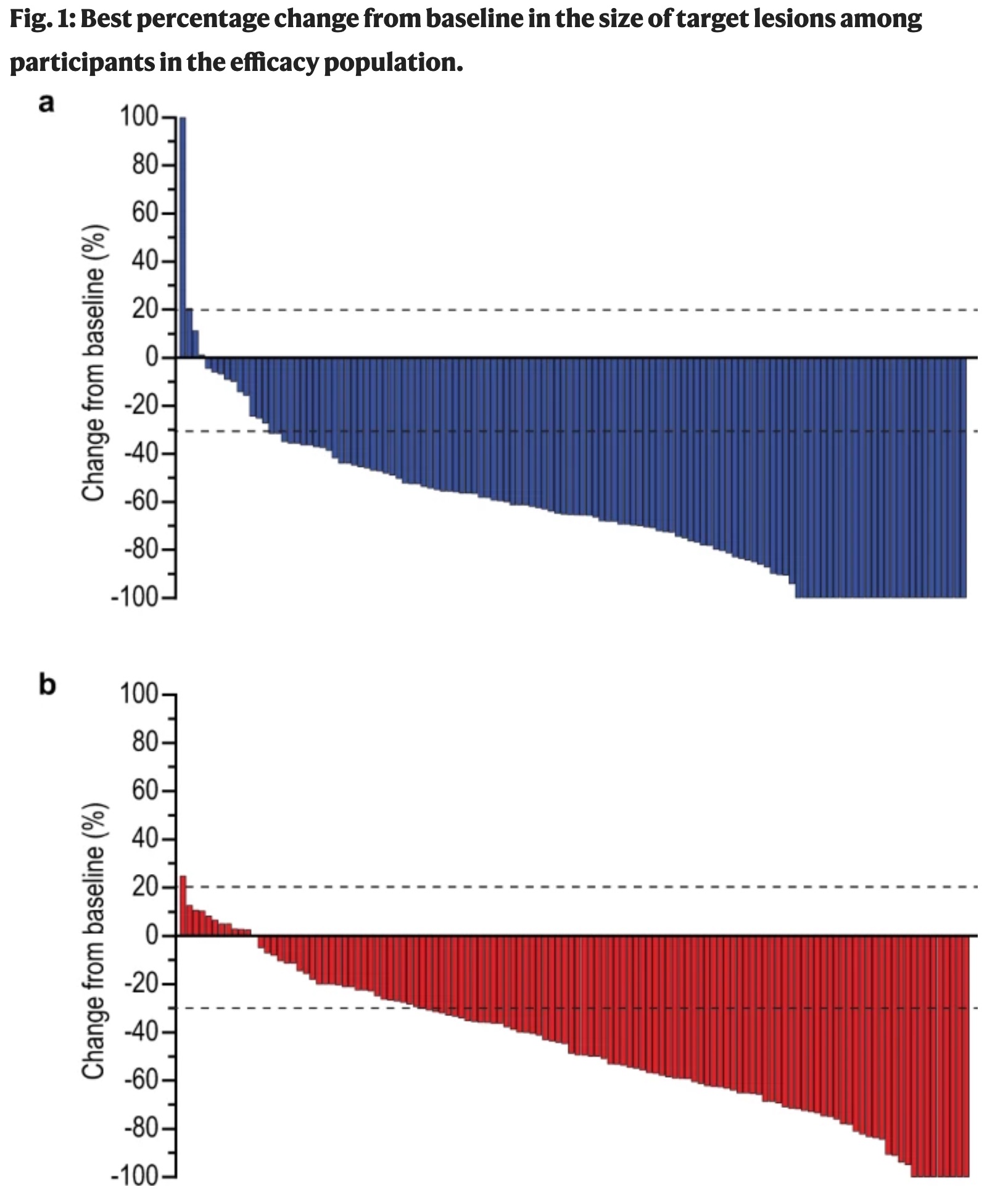
Title: The KEYNOTE-811 trial of dual PD-1 and HER2 blockade in HER2-positive gastric cancer
Journal: Nature
Authors: Janjigian YY, Kawazoe A, Yañez P et al.
Year: 2021
PMID: 34912120
DOI: 10.1038/s41586-021-04161-3
The original figure
Import libraries
library(tidyverse)
library(scales)
library(fabricatr)      # to fabricate fake data
library(patchwork)      # to combine plots
library(ggh4x)          # to modify y-axis ticks

theme_set(theme_light(base_family = "Helvetica Neue"))
Prepare fabricated data
set.seed(2022)
# Pembrolizumab group
pembro_progressive <- fabricate(
  N = 1,
  main_group = "Pembro",
  subgroup = "progressive",
  pre_treatment = 100,
  post_treatment = 240)

pembro_stabil <- fabricate(
  N = 15,
  main_group = "Pembro",
  subgroup = "stabil",
  pre_treatment = 100,
  post_treatment = round(runif(N, 70, 120))
  )

pembro_partial <- fabricate(
  N = 84,
  main_group = "Pembro",
  subgroup = "partial",
  pre_treatment = 100,
  post_treatment = round(runif(N, 1, 70))
  )

pembro_complete <- fabricate(
  N = 28,
  main_group = "Pembro",
  subgroup = "complete",
  pre_treatment = 100,
  post_treatment = 0)

set.seed(2022)
data_pembro <- bind_rows(pembro_progressive, pembro_stabil, pembro_partial, pembro_complete) %>%
  mutate(response_rate = pmin(100, 100 * (post_treatment - pre_treatment)/pre_treatment)) %>%
  filter(response_rate != 0) %>%
  sample_n(124)

# Placebo group
set.seed(2022)
placebo_progressive <- fabricate(
  N = 1,
  main_group = "Placebo",
  subgroup = "progressive",
  pre_treatment = 100,
  post_treatment = 128)

placebo_stabil <- fabricate(
  N = 38,
  main_group = "Placebo",
  subgroup = "stabil",
  pre_treatment = 100,
  post_treatment = round(runif(N, 70, 120))
  )

placebo_partial <- fabricate(
  N = 77,
  main_group = "Placebo",
  subgroup = "partial",
  pre_treatment = 100,
  post_treatment = round(runif(N, 1, 70))
  )

placebo_complete <- fabricate(
  N = 9,
  main_group = "Placebo",
  subgroup = "complete",
  pre_treatment = 100,
  post_treatment = 0)


set.seed(2022)
data_placebo <- bind_rows(placebo_progressive, placebo_stabil, placebo_partial, placebo_complete) %>%
  mutate(response_rate = 100 * (post_treatment - pre_treatment)/pre_treatment) %>%
  sample_n(122)

# combine datasets
combined_dataset <- bind_rows(data_pembro, data_placebo) %>%
  as_tibble () %>%
  select(-ID) %>%
  mutate(patient_ID = row_number(), .before = "main_group")
A part of fake dataset
set.seed(2022)
combined_dataset %>%
  sample_n(10)
## # A tibble: 10 × 6
##    patient_ID main_group subgroup pre_treatment post_treatment response_rate
##         <int> <chr>      <chr>            <dbl>          <dbl>         <dbl>
##  1        228 Placebo    stabil             100             78           -22
##  2        179 Placebo    partial            100             57           -43
##  3        206 Placebo    partial            100             21           -79
##  4         55 Pembro     partial            100             19           -81
##  5         75 Pembro     partial            100             66           -34
##  6        196 Placebo    partial            100             58           -42
##  7          6 Pembro     partial            100             33           -67
##  8        191 Placebo    partial            100             28           -72
##  9        244 Placebo    partial            100             59           -41
## 10        220 Placebo    partial            100             11           -89
Possible strategy:
Facet approach is OK but I will prepare two separate plots.
I decide this (faceted or separate plots) based on the complexity of axis etc.
However, We can use the @drob rule to decide.

R codes for the figure
# Pembro plot
plot_pembro <- combined_dataset %>%
  filter(main_group == "Pembro") %>%
  mutate(patient_ID = reorder(patient_ID, -response_rate)) %>%
  ggplot(aes(patient_ID, response_rate)) +
  geom_col(fill = "#2A4093", position = "dodge", color = "black") +
  scale_y_continuous(breaks = seq(-100, 100, 20),
                     minor_breaks = seq(-100, 100, by = 10),
                     guide = "axis_minor",
                     limits = c(-100, 100),
                     expand = c(0, 0))  +
  scale_x_discrete(expand = expansion(add = c(1,2))) +
  geom_hline(yintercept = c(-30, 20), lty = 2, size = .70) +
  geom_hline(yintercept = 0, lty = 1, size = .80) +
  labs(x = "",
       y = "Change from baseline (%)") +
  theme(axis.text.x = element_blank(),
        axis.text.y = element_text(size = 14),
        axis.title.y = element_text(size = 14),
        panel.grid = element_blank(),
        axis.ticks.x = element_blank(),
        axis.ticks.y = element_line(color = "black", size = 1),
        axis.ticks.length.y = unit(.3, "cm"),
        panel.border = element_blank(),
        axis.line.y = element_line(color = "black"),
        ggh4x.axis.ticks.length.minor = rel(0.5))

# Placebo plot (only filter and color hex was changed)
plot_placebo <- combined_dataset %>%
  filter(main_group == "Placebo") %>%
  mutate(patient_ID = reorder(patient_ID, -response_rate)) %>%
  ggplot(aes(patient_ID, response_rate)) +
  geom_col(fill = "#DF001B", position = "dodge", color = "black") +
  scale_y_continuous(breaks = seq(-100, 100, 20),
                     minor_breaks = seq(-100, 100, by = 10),
                     guide = "axis_minor",
                     limits = c(-100, 100),
                     expand = c(0, 0))  +
  scale_x_discrete(expand = expansion(add = c(1,2))) +
  geom_hline(yintercept = c(-30, 20), lty = 2, size = .70) +
  geom_hline(yintercept = 0, lty = 1, size = .80) +
  labs(x = "",
       y = "Change from baseline (%)") +
  theme(axis.text.x = element_blank(),
        axis.text.y = element_text(size = 14),
        axis.title.y = element_text(size = 14),
        panel.grid = element_blank(),
        axis.ticks.x = element_blank(),
        axis.ticks.y = element_line(color = "black", size = 1),
        axis.ticks.length.y = unit(.3, "cm"),
        panel.border = element_blank(),
        axis.line.y = element_line(color = "black"),
        ggh4x.axis.ticks.length.minor = rel(0.5))


# Combine plots
  final_replica <- plot_pembro / plot_placebo +
    plot_annotation(title = "Fig. 1: Best percentage change from baseline in the size of target lesions among \nparticipants in the efficacy population.",
                    tag_levels = "a") &
     theme(plot.tag = element_text(size = 16, face = "bold"),
           plot.title = element_text(face = "bold", family = "Palatino LT Black", hjust = 0, lineheight = 1.5))

 ## SAVE FIGURE
ggsave(final_replica,
       file =file.path ("w8_replica.jpg"),
       dpi = 300,
       width = 7.4,
       height = 9.2)
Final replica
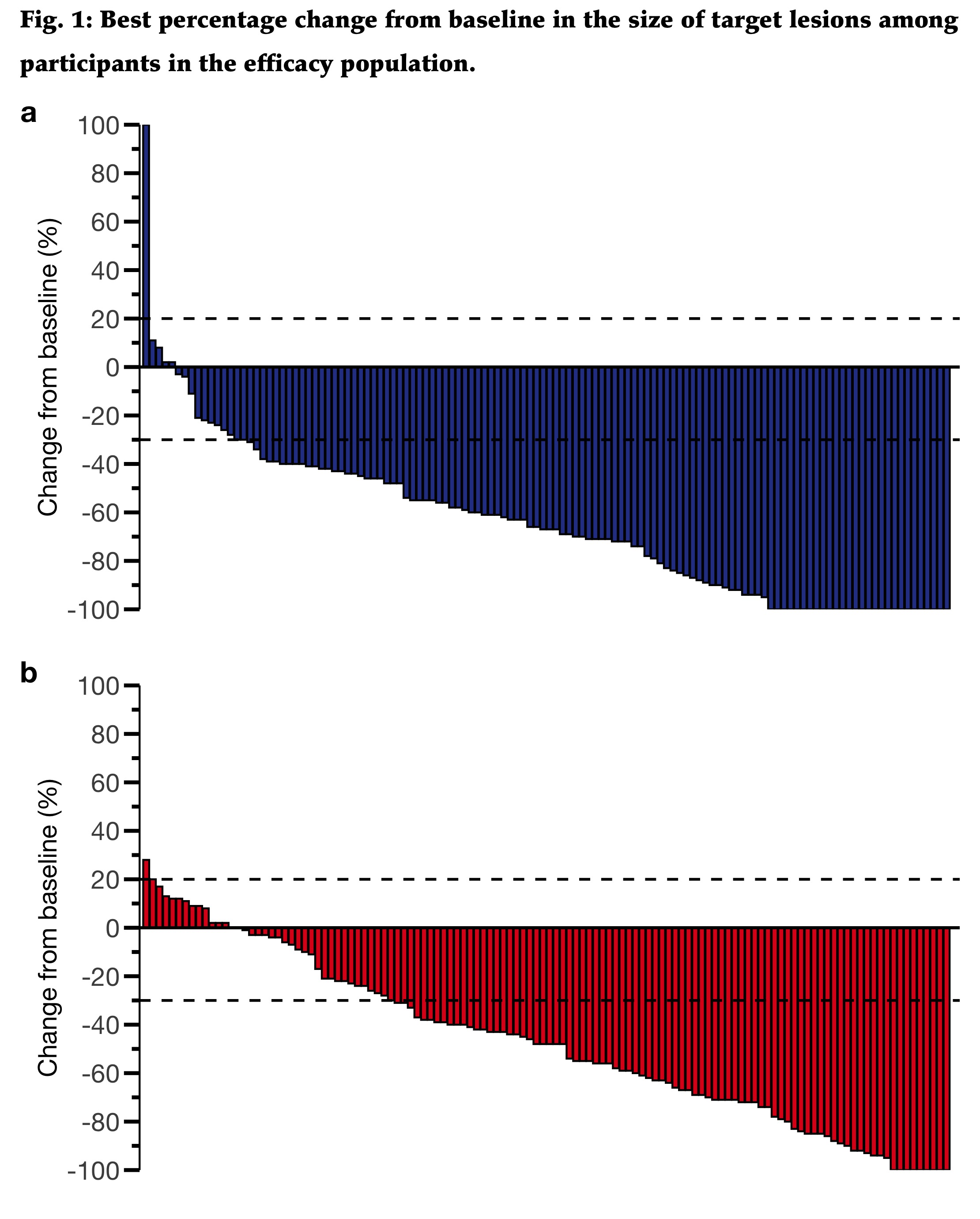
Some personal comments:
I m not sure whether this is an informative figure. I would prefer (based on domain knowledge) using bar graph to show the frequencies of the response group.
This one does not allow to compare the groups.
Citation
Ali Guner (Apr 14, 2022) Week-8. Retrieved from https://datavizmed.com/blog/2022-04-14-week-8/
@misc{ 2022-week-8,
author = { Ali Guner },
title = { Week-8 },
url = { https://datavizmed.com/blog/2022-04-14-week-8/ },
year = { 2022 }
updated = { Apr 14, 2022 }
}