Posts
This week’s article is from the University of Pennsylvania.
Selected article:
Title: Disparities in Presentation, Treatment, and Survival in Anaplastic Thyroid Cancer
Journal: Annals of Surgical Oncology
Authors: Ginzberg SP, Gasior JA, Passman JE et al.
Year: 2023
PMID: 37474696
DOI: 10.1245/s10434-023-13945-y
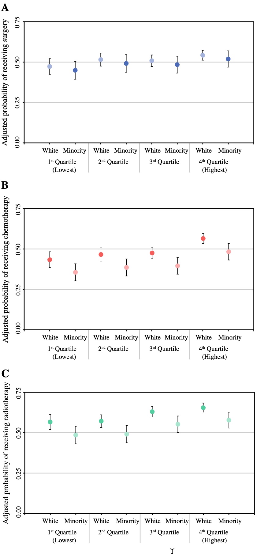
The original figure
Import libraries
# Define the required package names
packages <- c("tidyverse", "scales", "fabricatr", "glue",
              "ggtext", "cowplot")

# Function to check, install, and load packages
load_packages <- function(packages) {

  for (package in packages) {
    if (!require(package, character.only = TRUE)) {
        install.packages(package)
        library(package, character.only = TRUE)
    } else {
      # suppressPackageStartupMessages(library(package, character.only = TRUE))
        library(package, character.only = TRUE)
    }
  }
}

load_packages(packages)


theme_set(theme_light(base_family = "Times New Roman"))
Prepare fabricated data
generate_thyroid_data <- function(N, main_group, subgroup, prob_surgery, prob_chemo, prob_radio) {
  set.seed(2023)
  fabricate(
    N = N,
    main_group = main_group,
    subgroup = subgroup,
    surgery = draw_binary(N = N, prob = prob_surgery),
    chemotherapy = draw_binary(N = N, prob = prob_chemo),
    radiotherapy = draw_binary(N = N, prob = prob_radio)
  )
}

## Non-hispanic white
thyroid_white_q1 <- generate_thyroid_data(N = 498, main_group = "non_hispanic", subgroup = "Q1", 0.47, 0.45, 0.54)
thyroid_white_q2 <- generate_thyroid_data(N = 834, main_group = "non_hispanic", subgroup = "Q2", 0.52, 0.47, 0.55)
thyroid_white_q3 <- generate_thyroid_data(N = 1037, main_group = "non_hispanic", subgroup = "Q3", 0.51, 0.47, 0.61)
thyroid_white_q4 <- generate_thyroid_data(N = 1430, main_group = "non_hispanic", subgroup = "Q4", 0.54, 0.56, 0.63)

## Minority
thyroid_minority_q1 <- generate_thyroid_data(N = 263, main_group = "minority", subgroup = "Q1", 0.45, 0.32, 0.49)
thyroid_minority_q2 <- generate_thyroid_data(N = 204, main_group = "minority", subgroup = "Q2", 0.49, 0.34, 0.48)
thyroid_minority_q3 <- generate_thyroid_data(N = 217, main_group = "minority", subgroup = "Q3", 0.48, 0.35, 0.54)
thyroid_minority_q4 <- generate_thyroid_data(N = 277, main_group = "minority", subgroup = "Q4", 0.52, 0.48, 0.55)


## Combine 8 datasets
combined_dataset <- bind_rows(
        thyroid_white_q1,
        thyroid_white_q2,
        thyroid_white_q3,
        thyroid_white_q4,
        thyroid_minority_q1,
        thyroid_minority_q2,
        thyroid_minority_q3,
        thyroid_minority_q4) %>%
        as_tibble() %>%
        mutate(across(surgery:radiotherapy, ~if_else(. == 1, "yes", "no")))
A part of fake dataset
set.seed(2023)
combined_dataset %>%
        sample_n(10)
## # A tibble: 10 × 6
##    ID    main_group   subgroup surgery chemotherapy radiotherapy
##    <chr> <chr>        <chr>    <chr>   <chr>        <chr>
##  1 0110  non_hispanic Q4       yes     yes          yes
##  2 0053  non_hispanic Q3       yes     yes          no
##  3 0660  non_hispanic Q3       no      yes          no
##  4 0985  non_hispanic Q4       yes     no           yes
##  5 368   non_hispanic Q2       yes     no           yes
##  6 0233  non_hispanic Q3       yes     no           yes
##  7 1264  non_hispanic Q4       yes     yes          yes
##  8 659   non_hispanic Q2       yes     yes          yes
##  9 461   non_hispanic Q2       yes     no           no
## 10 095   minority     Q4       no      no           no
Possible strategy:
I ll go with faceted figure.
I ll write a custom function for one facet (quartiles), and I ll use the function for all three treatment types.
The most difficult (and useless) part was to add gray vertical lines between facet names. I used cowplot::draw_line() to add manuel lines. This solution solved the problem but seems problematic because the coordinates should be defined manually and checked individually.
Calculate percentages and CIs
cis_dataset <- combined_dataset %>%
         pivot_longer(cols = c(surgery:radiotherapy)) %>%
         group_by(main_group, subgroup, name) %>%
         summarise(count_yes = sum(value == "yes"),
                   n = n(),
                   prop_yes = count_yes / n,
                   conf_interval = list(prop.test(count_yes, n)$conf.int),
                   .groups = "drop") %>%
        mutate(lower_bound = map_dbl(conf_interval, ~ .x[1]),
               upper_bound = map_dbl(conf_interval, ~ .x[2])) %>%
        select(-conf_interval)
R codes for the figure
quartile_names <- as_labeller(c(                        # for facet names
  "Q1" = "1^st^ Quartile<br>(Lowest)",
  "Q2" = "2^nd^ Quartile",
  "Q3" = "3^rd^ Quartile",
  "Q4" = "4^th^ Quartile<br>(Highest)"
))


draw_myplot <- function(my_name){

text_y <- glue::glue("Adjusted probability of receiving {my_name}")             # to add y-axis title dynamically

selected_colors <- case_when(                                                   # to define colors dynamically
        my_name == "surgery" ~ c("#A6B5D8", "#5069B8"),
        my_name == "chemotherapy" ~ c("#E3665E", "#F0B1B2"),
        my_name == "radiotherapy" ~ c("#75CEA5", "#B5E7D2"))

initial_plot <- cis_dataset %>%
        mutate(main_group = fct_relevel(main_group, "non_hispanic"),
               name = fct_relevel(name, "surgery", "chemotherapy", "radiotherapy")) %>%
        filter(name == {{my_name}}) %>%
        ggplot(aes(main_group, prop_yes, color = main_group)) +
        geom_errorbar(aes(ymin = lower_bound,
                          ymax = upper_bound), color = "black", width = 0.1) +
        geom_point(size = 2.5) +
        facet_wrap( ~ subgroup, ncol = 4, strip.position = "bottom",  scales = "free_x", labeller = quartile_names) +
        scale_y_continuous(limits = c(0, .75), breaks = seq(0, .75, .25), expand = c(0,0), sec.axis = dup_axis(breaks = NULL)) +
        scale_x_discrete(labels = c("White", "Minority")) +
        scale_color_manual(values = selected_colors) +
        geom_hline(yintercept = 0.75, color = "black", linewidth = 1) +
        labs(x = element_blank(),
             y = text_y) +
        theme(legend.position = "none",
              text = element_text(color = "black"),
              axis.text.y = element_text(angle = 90, hjust = 0.5),
              axis.title.y.right = element_blank(),
              axis.title.y = element_text(size = 10, margin = margin(r = 6)),
              axis.line = element_line(color = "black"),
              axis.ticks = element_line(color = "black", size = .5),
              strip.placement = "outside",
              strip.text = ggtext::element_markdown(color = "black", lineheight = 1),
              strip.background = element_blank(),
              panel.border = element_blank(),
              panel.grid.minor.y = element_blank(),
              panel.grid.major.x = element_blank(),
              panel.spacing = unit(0, "lines"),
              plot.margin = margin(1, 1, 0, .2, "cm"))


final_plot <- ggdraw() +
        draw_plot(initial_plot) +
        draw_line(x = c(0.29, 0.29),                    # to add vertical line between facet names manually
            y = c(0.19, 0),
            lwd = 0.5,
            colour = "gray") +
        draw_line(x = c(0.50, 0.50),                    # to add vertical line between facet names manually
            y = c(0.19, 0),
            lwd = 0.5,
            colour = "gray") +
        draw_line(x = c(0.71, 0.71),                    # to add vertical line between facet names manually
            y = c(0.19, 0),
            lwd = 0.5,
            colour = "gray")

return(final_plot)
}


final_replica <- plot_grid(                             # to combine 3 plots and to add Tags
        draw_myplot("surgery"),
        draw_myplot("chemotherapy"),
        draw_myplot("radiotherapy"),
        labels = "AUTO",
        label_fontface = "bold",
        vjust = 1,
        hjust = -.5,
        ncol = 1)


### SAVE FIGURE
ggsave(final_replica,
       file =file.path ("w12_replica.jpg"),
       dpi = 300,
       width = 5,
       height = 10)
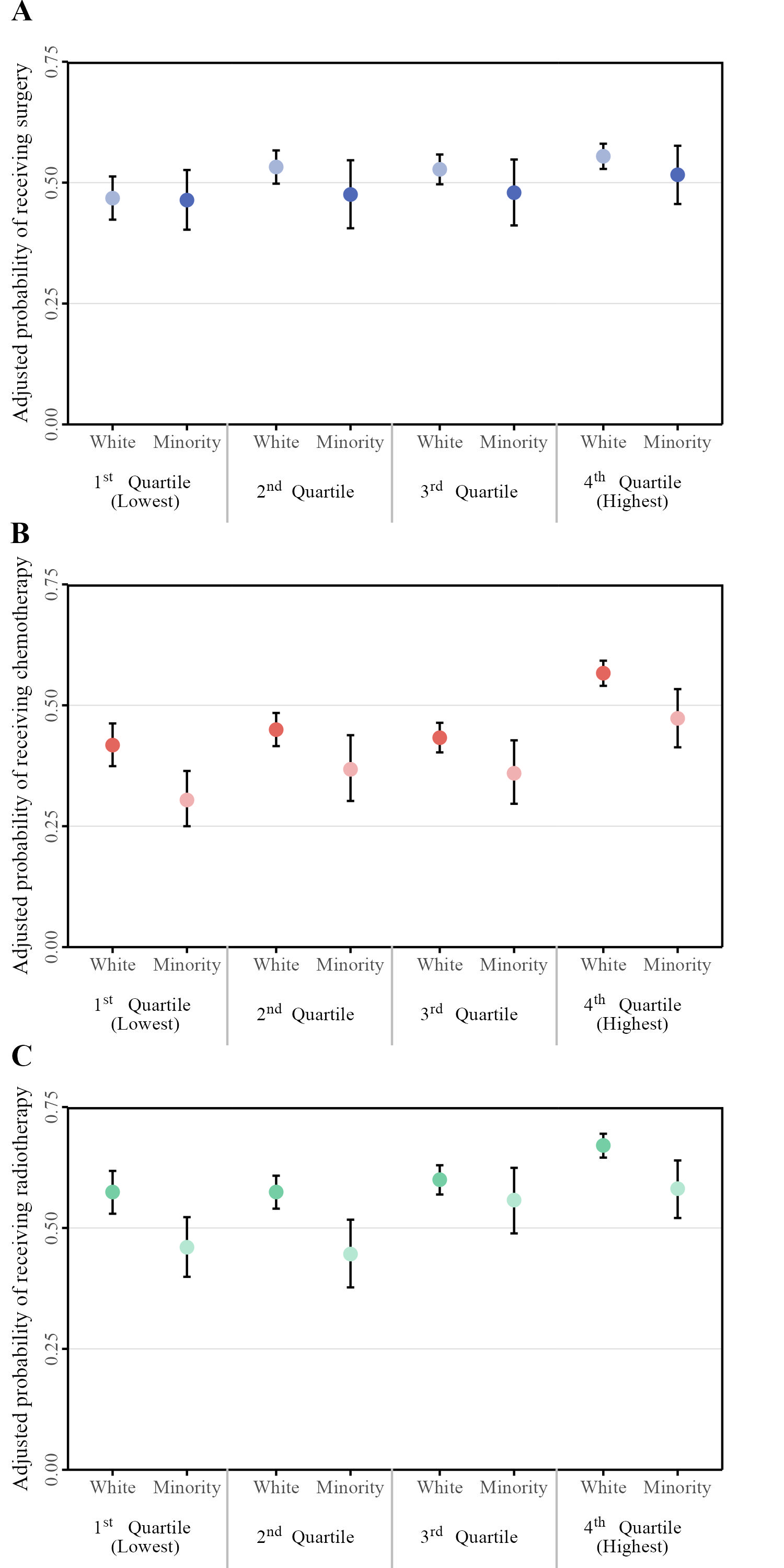
Final replica
Some personal comments:
Citation
Ali Guner (Oct 25, 2023) W12 - Errorbar plots with facets. Retrieved from https://datavizmed.com/blog/2023-10-25-week-12/
@misc{ 2023-w12-errorbar-plots-with-facets,
author = { Ali Guner },
title = { W12 - Errorbar plots with facets },
url = { https://datavizmed.com/blog/2023-10-25-week-12/ },
year = { 2023 }
updated = { Oct 25, 2023 }
}