Posts
I ll reproduce a visual abstract, not a single published figure. Will combine survival analysis with plotting.
Selected article:
Title: First-Line Selpercatinib or Chemotherapy and Pembrolizumab in RET Fusion–Positive NSCLC
Journal: NEJM
Authors: Zhou C, Solomon B, Loong HH et al.
Year: 2023
PMID: 37870973
DOI: 10.1056/NEJMoa2309457.
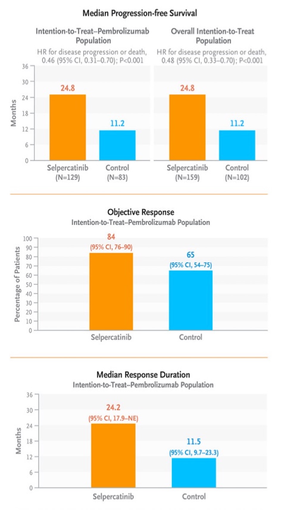
The original figure
Import libraries
# Define the required package names
packages <- c("tidyverse", "scales", "fabricatr", "glue",
              "cowplot",
              "finalfit",
              "survminer", "survival")

# Function to check, install, and load packages
load_packages <- function(packages) {

  for (package in packages) {
    if (!require(package, character.only = TRUE)) {
        install.packages(package)
        library(package, character.only = TRUE)
    } else {
      # suppressPackageStartupMessages(library(package, character.only = TRUE))
        library(package, character.only = TRUE)
    }
  }
}

load_packages(packages)


theme_set(theme_light(base_family = "Helvetica"))

nejm_orange <- "#F09B1A"
nejm_blue <- "#50BDFE"
Prepare fabricated data
# n_exp <- c(129, 105, 72, 44, 16, 2, 0)
# n_control <- c(83, 55, 29, 15, 6, 0, 0)

n_exp <- c(159, 130, 90, 52, 18, 3, 0)
n_control <- c(103, 63, 33, 16, 7, 1, 0)

fu_one_period_experimental <- vector()
fu_one_period_control <- vector()

for (i in 1:length(n_exp)-1){
  fu_experimental <-  n_exp[i] - n_exp[i + 1]
  fu_control <-  n_control[i] - n_control[i + 1]

  fu_one_period_control[i] <- fu_control
  fu_one_period_experimental[i] <- fu_experimental
}


p_exp     <- c(.70, .60, .45, .35, .25, .03)
p_control <- c(.79, .50, .45, .24, .15, .10)

dataset_experimental_all <- list()
dataset_control_all <- list()

for (i in 1:(length(n_exp)-1)){
set.seed(2023)
dataset_experimental <- fabricate(
  N = fu_one_period_experimental[i],
  fu_time = runif(N, min = 0, max = 6),
  event = draw_binary(prob = p_exp[i], N = N)
) %>%
  as_tibble() %>%
  mutate(event_time = fu_time + 6 * (i - 1),
         group = "experimental")

dataset_experimental_all[[i]] <- dataset_experimental
}
unlist_experimental <-  map_dfr(dataset_experimental_all, bind_rows) %>%
  mutate(event = replace_na(event, 0))


for (i in 1:(length(n_control)-2)){
set.seed(2023)
dataset_control <- fabricate(
  N = fu_one_period_control[i],
  fu_time = runif(N, min = 0, max = 6),
  event = draw_binary(prob = p_control[i], N = N)
) %>%
  as_tibble() %>%
  mutate(event_time = fu_time + 6 * (i - 1),
         group = "control")

dataset_control_all[[i]] <- dataset_control
}
unlist_control <-  map_dfr(dataset_control_all, bind_rows)


set.seed(2023)
experimental_pembro <- fabricate(
  N = 129,
  pembro = "yes",
  response = c(rep("CR", 9), rep("PR", 99), rep("SD", 14), rep("PD", 2), rep("NE", 5)),
  duration_response = round(rnorm(N, mean = 24.2, sd = 4), 1)) %>%
        as_tibble() %>%
        mutate(ID = as.numeric(ID))

set.seed(2023)
control_pembro <- fabricate(
  N = 83,
  pembro = "yes",
  response = c(rep("CR", 5), rep("PR", 49), rep("SD", 20), rep("PD", 5), rep("NE", 4)),
  duration_response = round(rnorm(N, mean = 18, sd = 3), 1)) %>%
        as_tibble() %>%
        mutate(ID = as.numeric(ID))


set.seed(2023)
combined_dataset <- bind_rows(
        unlist_experimental %>%
                sample_n(nrow(.)) %>%
                mutate(ID = row_number()) %>%
                left_join(experimental_pembro, join_by(ID)),
        unlist_control %>%
                sample_n(nrow(.)) %>%
                mutate(ID = row_number()) %>%
                left_join(control_pembro, join_by(ID))
        ) %>%
        select(-fu_time) %>%
        mutate(event_time = round(event_time, 2),
         event = replace_na(event, 0),
         group = fct_relevel(group,"control", "experimental"),
         pembro = if_else(is.na(pembro), "no", pembro),
         response = if_else(is.na(response), "not needed", response))
A part of fake dataset
set.seed(2023)
combined_dataset %>%
        sample_n(10)
## # A tibble: 10 × 7
##       ID event event_time group        pembro response   duration_response
##    <dbl> <int>      <dbl> <fct>        <chr>  <chr>                  <dbl>
##  1    84     1       5.17 control      no     not needed              NA
##  2    44     1      20.0  experimental yes    PR                      23.4
##  3    34     1      14.9  control      yes    PR                      17.9
##  4    29     0      26.0  experimental yes    PR                      30.3
##  5    49     0      16.6  experimental yes    PR                      25.5
##  6    50     0       0.73 control      yes    PR                      20.3
##  7   125     0       0.86 experimental yes    NE                      21.1
##  8   133     0      17.3  experimental no     not needed              NA
##  9    72     1      21.7  experimental yes    PR                      20.5
## 10    32     0       2.86 control      yes    PR                      21.8
Possible strategy:
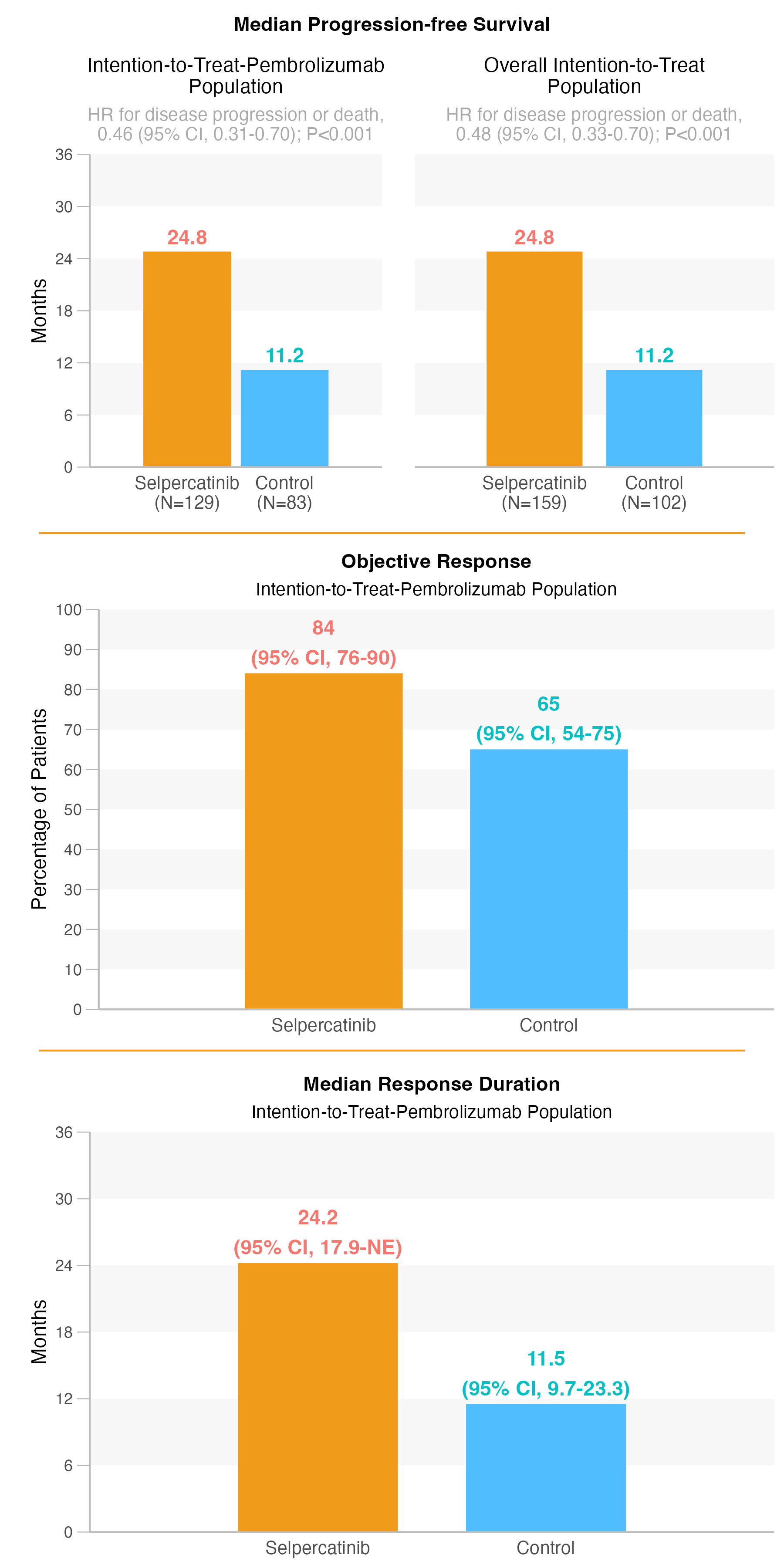
Little bit complex figure. Firstly, It is not possible to fabricate totally same survival data. But I tried very close one.
It was possible to define only HRs with CIs as text, I want to show the possible Cox analysis, and pull required HRs,CIs,p value, and convert it required text format with regex.
I planned to make first two figures after cox analysis. I also calculated median survival with CIs. Because of the consistency, I changed my numbers into desired one. Than I combined both as one figure.
Then, I did second figure. It was possible to make exact dataset based on the tables from the paper.
Last figure was also close because of it contains time data. I corrected findings for the consistency.
Then I combined three plots with cowplot.
R codes for the figures and required data
Fig 1a and Fig 1b
explanatory <- combined_dataset %>%
        select(group) %>%
        names()

dependent <- "Surv(event_time, event)"

# Fig 1a
# HRs and median survival for Intention-to-Treat-Pembrolizumab (with finalfit package) for Fig 1a

cox_pembro <- combined_dataset %>%
        filter(pembro == "yes") %>%
        finalfit::finalfit(dependent = dependent,
                           explanatory = explanatory,
                           add_dependent_label = FALSE) %>%
        select(label, levels, my_hr = "HR (univariable)") %>%
        mutate(formatted_hr = str_replace_all(my_hr, "^(\\d+\\.\\d+) \\((\\d+\\.\\d+-\\d+\\.\\d+), p[=<](.+?)\\)$", "\\1 (95% CI \\2); p<\\3"),
               corrected_hr = if_else(levels == "experimental", "0.46 (95% CI, 0.31-0.70); P<0.001", "-"))


model_plot_pembro <- survfit(Surv(event_time, event) ~ group, data = combined_dataset %>% filter(pembro == "yes"))
model_table_pembro <- model_plot_pembro %>%
        surv_median() %>%
        as_tibble() %>%
        mutate(n = if_else(str_detect(strata, "control"), model_plot_pembro$n[1], model_plot_pembro$n[2]),
               corrected_median = if_else(str_detect(strata, "control"), 11.2, 24.8))


cox_pembro_hr <- cox_pembro %>%
        filter(levels == "experimental") %>%
        pull(corrected_hr)


fig_1a <- model_table_pembro %>%
        mutate(strata = if_else(strata == "group=control", "Control", "Selpercatinib"),
               label = glue::glue("{strata}\n(N={n})"),
               label = fct_rev(label)) %>%
        ggplot(aes(label, y = corrected_median, fill = label)) +
        geom_col(width = .9) +
        geom_rect(aes(xmin = 0, xmax = 3, ymin = 6, ymax = 12),
            fill = "lightgray", alpha = 0.1) +
        geom_rect(aes(xmin = 0, xmax = 3, ymin = 18, ymax = 24),
            fill = "lightgray", alpha = 0.1) +
        geom_rect(aes(xmin = 0, xmax = 3, ymin = 30, ymax = 36),
            fill = "lightgray", alpha = 0.1) +
        geom_col(width = .9) +
        scale_fill_manual(values = c(nejm_orange, nejm_blue)) +
        scale_y_continuous(limits = c(0, 36), breaks = seq(0,36,6), expand = c(0,0)) +
        geom_text(aes(label = corrected_median, color = label), vjust = -0.5, size = 4, fontface = "bold") +
        labs(x = NULL,
             y = "\nMonths",
             subtitle = glue::glue("HR for disease progression or death,\n{cox_pembro_hr}"),
             title = "Intention-to-Treat-Pembrolizumab\nPopulation") +
        theme(legend.position = "none",
              panel.grid = element_blank(),
              plot.title = element_text(hjust = .5, size = 11),
              plot.subtitle = element_text(hjust = .5, size = 10, color = "darkgray"),
              axis.ticks.x = element_blank(),
              axis.ticks.length.y = unit(.25, "cm"),
              axis.text.x = element_text(size = 10),
              panel.border = element_blank(),
              axis.line = element_line(color = "gray"))


# Fig 1b
# HR and median survival for Overall Intention-to-Treat Population (with finalfit package) for Fig 1b

cox_all <- combined_dataset %>%
        finalfit::finalfit(dependent = dependent,
                           explanatory = explanatory,
                           add_dependent_label = FALSE) %>%
        select(label, levels, my_hr = "HR (univariable)") %>%
        mutate(formatted_hr = str_replace_all(my_hr, "^(\\d+\\.\\d+) \\((\\d+\\.\\d+-\\d+\\.\\d+), p[=<](.+?)\\)$", "\\1 (95% CI \\2); p<\\3"),
               corrected_hr = if_else(levels == "experimental", "0.48 (95% CI, 0.33-0.70); P<0.001", "-"))


model_plot_all <- survfit(Surv(event_time, event) ~ group, data = combined_dataset)
model_table_all <- model_plot_all %>%
        surv_median() %>%
        as_tibble() %>%
        mutate(n = if_else(strata == "group=control", model_plot_all$n[1], model_plot_all$n[2]),
               corrected_median = if_else(strata == "group=control", 11.2, 24.8))


cox_all_hr <- cox_all %>%
        filter(levels == "experimental") %>%
        pull(corrected_hr)


# y-axis has no value. It would be better do this with facet_wrap("free_y"), But I realized this very late.
# So, I removed y-axis data from second plot.
fig_1b <- model_table_all %>%
        mutate(strata = if_else(str_detect(strata, "control"), "Control", "Selpercatinib"),
               label = glue::glue("{strata}\n(N={n})"),
               label = fct_rev(label)) %>%
        ggplot(aes(label, y = corrected_median, fill = label)) +
        geom_col(width = .8) +
        geom_rect(aes(xmin = 0, xmax = 3, ymin = 6, ymax = 12),
            fill = "lightgray", alpha = 0.1) +
        geom_rect(aes(xmin = 0, xmax = 3, ymin = 18, ymax = 24),
            fill = "lightgray", alpha = 0.1) +
        geom_rect(aes(xmin = 0, xmax = 3, ymin = 30, ymax = 36),
            fill = "lightgray", alpha = 0.1) +
        geom_col(width = .8) +
        scale_fill_manual(values = c(nejm_orange, nejm_blue)) +
        scale_y_continuous(limits = c(0, 36), breaks = seq(0,36,6), expand = c(0,0)) +
        geom_text(aes(label = corrected_median, color = label), vjust = -0.5, size = 4, fontface = "bold") +
        labs(x = NULL,
             y = NULL,
             subtitle = glue::glue("HR for disease progression or death,\n{cox_all_hr}"),
             title = "Overall Intention-to-Treat\nPopulation") +
        theme(legend.position = "none",
              panel.grid = element_blank(),
              plot.title = element_text(hjust = .5, size = 11),
              plot.subtitle = element_text(hjust = .5, size = 10, color = "darkgray"),
              axis.ticks = element_blank(),
              axis.ticks.length.y = unit(.25, "cm"),
              axis.text.x = element_text(size = 10),
              panel.border = element_blank(),
              axis.line.x = element_line(color = "gray"),
              axis.text.y = element_blank())


# Combine Fig 1a and Fig 1b

fig_1 <- cowplot::plot_grid(fig_1a, fig_1b, ncol = 2)

# Add shared title to fig 1

fig_1_title <- ggdraw() +
  draw_label(
    "Median Progression-free Survival",
    fontface = 'bold',
    hjust = .5,
    size = 11
  )


fig_1_cow <- plot_grid(
  fig_1_title, fig_1,
  ncol = 1,
  rel_heights = c(0.1, 1)
)
### response
response_summary <- combined_dataset %>%
        filter(pembro == "yes") %>%
        mutate(objective_response = case_match(response,
                          c("CR", "PR") ~ "yes",
                          c("PD", "SD", "NE") ~ "no")) %>%
        group_by(group) %>%
        summarise(response_rate = mean(objective_response == "yes", na.rm = TRUE),
                  lower_ci = binom.test(sum(objective_response == "yes"), length(objective_response), conf.level = 0.95)$conf.int[1],
                  upper_ci = binom.test(sum(objective_response == "yes"), length(objective_response), conf.level = 0.95)$conf.int[2]) %>%
        mutate(across(-group, ~round(. * 100)))


fig_2 <- response_summary %>%
        mutate(group = if_else(str_detect(group, "control"), "Control", "Selpercatinib"),
               group = fct_rev(group),
               label_text = glue::glue("{response_rate}\n(95% CI, {lower_ci}-{upper_ci})")) %>%
        ggplot(aes(group, y = response_rate, fill = group)) +
        geom_col(width = .7) +
        geom_rect(aes(xmin = 0, xmax = 3, ymin = 10, ymax = 20),
            fill = "lightgray", alpha = 0.1) +
        geom_rect(aes(xmin = 0, xmax = 3, ymin = 30, ymax = 40),
            fill = "lightgray", alpha = 0.1) +
        geom_rect(aes(xmin = 0, xmax = 3, ymin = 50, ymax = 60),
            fill = "lightgray", alpha = 0.1) +
        geom_rect(aes(xmin = 0, xmax = 3, ymin = 70, ymax = 80),
            fill = "lightgray", alpha = 0.1) +
        geom_rect(aes(xmin = 0, xmax = 3, ymin = 90, ymax = 100),
            fill = "lightgray", alpha = 0.1) +
        geom_col(width = .7) +
        scale_fill_manual(values = c(nejm_orange, nejm_blue)) +
        scale_y_continuous(limits = c(0, 100), breaks = seq(0, 100, 10), expand = c(0,0)) +
        geom_text(aes(label = label_text, color = group), vjust = -0.2, size = 4, fontface = "bold") +
        labs(x = NULL,
             y = "\nPercentage of Patients",
             subtitle = "Intention-to-Treat-Pembrolizumab Population",
             title = "\nObjective Response") +
        theme(legend.position = "none",
              panel.grid = element_blank(),
              plot.title = element_text(hjust = .5, size = 11, face = "bold"),
              plot.subtitle = element_text(hjust = .5, size = 10),
              axis.ticks.x = element_blank(),
              axis.ticks.length.y = unit(.25, "cm"),
              axis.text.x = element_text(size = 10),
              panel.border = element_blank(),
              axis.line = element_line(color = "gray"))
### response duration
response_duration_summary <- combined_dataset %>%
        filter(pembro == "yes") %>%
        group_by(group) %>%
        summarise(median = median(duration_response, na.rm = TRUE),
                   lower_ci = t.test(duration_response, conf.level = 0.95)$conf.int[1],
                   upper_ci = t.test(duration_response, conf.level = 0.95)$conf.int[2]) %>%
        mutate(corrected_median = if_else(group == "control", 11.5, 24.2),
               corrected_lower_ci = if_else(group == "control", 9.7, 17.9),
               corrected_upper_ci = if_else(group == "control", as.character(23.3), "NE"))


fig_3 <- response_duration_summary %>%
        mutate(group = if_else(str_detect(group, "control"), "Control", "Selpercatinib"),
               group = fct_rev(group),
               label_text = glue::glue("{corrected_median}\n(95% CI, {corrected_lower_ci}-{corrected_upper_ci})")) %>%
        ggplot(aes(group, y = corrected_median, fill = group)) +
        geom_col(width = .7) +
        geom_rect(aes(xmin = 0, xmax = 3, ymin = 6, ymax = 12),
            fill = "lightgray", alpha = 0.1) +
        geom_rect(aes(xmin = 0, xmax = 3, ymin = 18, ymax = 24),
            fill = "lightgray", alpha = 0.1) +
        geom_rect(aes(xmin = 0, xmax = 3, ymin = 30, ymax = 36),
            fill = "lightgray", alpha = 0.1) +
        geom_col(width = .7) +
        scale_fill_manual(values = c(nejm_orange, nejm_blue)) +
        scale_y_continuous(limits = c(0, 36), breaks = seq(0, 36, 6), expand = c(0,0)) +
        geom_text(aes(label = label_text, color = group), vjust = -0.2, size = 4, fontface = "bold") +
        labs(x = NULL,
             y = "\nMonths",
             subtitle = "Intention-to-Treat-Pembrolizumab Population",
             title = "\nMedian Response Duration") +
        theme(legend.position = "none",
              panel.grid = element_blank(),
              plot.title = element_text(hjust = .5, size = 11, face = "bold"),
              plot.subtitle = element_text(hjust = .5, size = 10),
              axis.ticks.x = element_blank(),
              axis.ticks.length.y = unit(.25, "cm"),
              axis.text.x = element_text(size = 10),
              panel.border = element_blank(),
              axis.line = element_line(color = "gray"))
# COMBINE all 3 plots and add horizontal orange lines

combined_plot <- cowplot::plot_grid(fig_1_cow, fig_2, fig_3, ncol = 1)

final_replica <- ggdraw() +
        draw_plot(combined_plot) +
        draw_line(
                x = c(0.05, .95),                    # to add horizontal line between facet names manually
                y = c(.33, .33),
                lwd = .5,
                colour = nejm_orange) +
        draw_line(
                x = c(0.05, .95),                    # to add horizontal line between facet names manually
                y = c(.66, .66),
                lwd = .5,
                colour = nejm_orange)


### SAVE FIGURE
ggsave(final_replica,
       file = file.path ("w13_replica.jpg"),
       dpi = 300,
       width = 6,
       height = 12)
Final replica
Some personal comments:
Citation
Ali Guner (Nov 19, 2023) W13 - Cox regression and Bar plots for some data. Retrieved from https://datavizmed.com/blog/2023-11-19-week-13/
@misc{ 2023-w13-cox-regression-and-bar-plots-for-some-data,
author = { Ali Guner },
title = { W13 - Cox regression and Bar plots for some data },
url = { https://datavizmed.com/blog/2023-11-19-week-13/ },
year = { 2023 }
updated = { Nov 19, 2023 }
}